If you think ‘visual consistency’ sounds sleep inducing, before you doze off let’s be clear what it is. Visual consistency means across your website:
- Text colours, styles and fonts are used in the same way
- Similar kinds of content are laid out in similar ways
- Logos and images are displayed in the same way
- Headers and footers are the same
Think about it … any site which is visually consistent looks clean, tidy and professional. In fact, insisting on visual consistency is the simplest way to improve any website.
Do you dream about raising your brand profile?
Visual consistency makes the look and feel of your website match the rest of your organisation’s public presence. In other words, it’s about making sure your website properly represents your organisation’s brand!
By now it should be worth waking up.
How visually consistent is your website?
Go on, take a good hard look. From page to page, how consistently is your content displayed? If everything looks great pat yourself on the back but keep reading, just in case there’s something you missed.
If your site looks like somebody pulled out their crayons and got creative don’t panic, you can fix it. First, another burning question.
Who looks after your online brand?
Thinking about your communications department? Think again.
Website admins after often thought of as ‘those people who update the website’. But hold on, if they maintain and update your website content, then they are the true guardians of your online branding!
Think your website admins might be important now?
Read more: Website Content Guidelines: Staying On-Topic and On-Brand
Make sure your website admins can do their job well
Website admins need to know what styles and layouts to use where but often they don’t, and there are three ways this can happen.
- Styles and their uses on your website have not been agreed (when done this is a website style guide)
- A style guide has been agreed but not implemented
- A style guide has been agreed and implemented, however the guidelines don’t work well in practice, so people don’t follow them.
If you put your hand up for number two, congratulations! You know what to do, though you may need some help doing it. Hop down to [Get your style guide into use] below.
For numbers one and three there’s some thinking to be done. Either on your own or with others in your organisation, you need to work out what styles need to be in use on your site, and also make sure they’ll work well in practice.
- If you’re in charge and your branding is simple chances are you can make decisions yourself and refine them as you go along.
Our advice: go for a simple and clean look. Most of all think about how everything will look on a mobile device. Busy and fussy don’t work on a small screen, so keep it simple.
- If you have a fully developed visual brand already talk to your designer (or us) about developing a style guide for your website.
- If you’re in a larger organisation other people will need to be involved in the discussion. In particular, be sure to involve one or more of your organisation’s website admins.
Why? They work with the website from day to day. They already know what works and what the problems are.
Important: Print branding does NOT translate well onto the web. The rules are different online so make sure you get expert advice in this area. We understand how to make your print brand look good online and we’re happy to help.
Get your style guide into use
It’s one thing to create a shiny new style guide. It’s another to have it used organisation and website-wide, particularly if you have a large website. There’s no substitute for a full website review but in the meantime, how about this?
Make it a rule that if anyone edits anything on a webpage, the new style guide is applied to the WHOLE of that page at the time.
Admittedly on large pages a chunk of work may need to be done, perhaps in sections. Get it done. Divide and conquer and delegate if you have to, but get it done.
This way pages which are most often updated become visually consistent soonest. Given that these pages are also often the most viewed pages on your website, that’s a bonus.
This approach isn’t the same as reviewing and updating the whole site, but it’s way better than doing nothing. When you’re ready, you can do a full review of your website to make it squeaky clean.
The best part? When website administrators habitually clean up incorrect formatting as they go, every time anyone touches a page something improves. More than that the habit of fixing visual inconsistencies when they’re found becomes normal business practice.
How copy and paste can be the enemy of visual consistency online
You just received something cool in an email, and you want to put it on your site. Easy copy and paste, right?
Wrong.
Never copy and paste anything directly into your site. Not from an email, a Word document, another web page, anywhere. Never.
Why?
Every word of online or electronic text comes with its own formatting.
Blissfully unaware you copy, paste into your site, save, and there it is. Except there are weird fonts you can’t get rid of, or huge spaces between lines which you can’t delete. Or you try to paste in a table and it’s a mess.
Your frustration is caused by styles which are coded invisibly onto the words you see on screen. (A good thing too or everything would look the same.)
Before you Paste, strip hidden formats
If you want the words without the weird there’s something you need to do in between Copy and Paste.
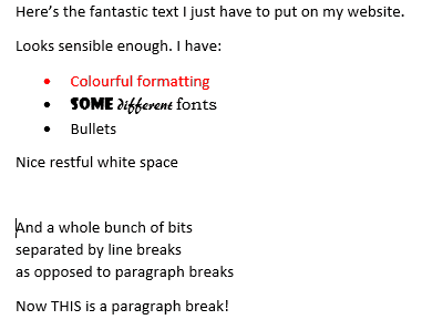
If you’re on Windows you can use Notepad for this job. If you’re on Mac, use TextEdit (see how to make plain text your default mode). Let’s say you want to grab something from a Word document and put it into your site, like this:
To get the words without the weird:
1. Copy the words you want to put on your website and paste them into Notepad or TextEdit. This strips the formatting off them.
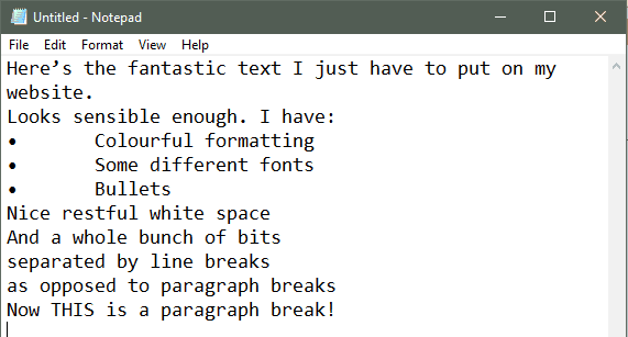
Notice that the ‘nice restful white space’ has gone along with the formatting. In the original document that paragraph was set to have 30 pixels of space after.
In Notepad it’s gone, along with the colours, fonts and everything.
This is why those weird things happen. If you copy and paste straight into your website’s text editor there’s no way to know how much invisible formatting will follow you in. Best to strip it clean first.
You can also see that Notepad generally treats line breaks and paragraph breaks the same. More on this later.
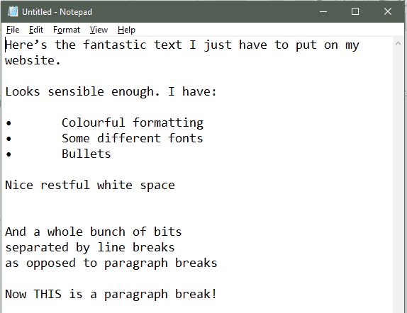
2. Add in blank lines where you want them.
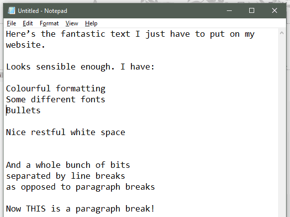
3. Remove the ‘translated’ bullets.
4. Copy this clean text from Notepad/TextEdit, and paste it into your website’s text editor. Then you’re ready to apply formatting and build any links you want.
Right now is when you need to be using font sizes, colours and styles consistently throughout your site. Fancy formats and bright colours might look fine in the email you just copied, but when text styles chop and change from web page to web page your site looks messy and unprofessional.
Text Editor quirk: the extra blank lines may turn out to be excess
I’ve noticed text editors on websites are quirky and each one does things slightly differently. So you may find you don’t need any blank lines inserted. It all depends on how your site’s text styles are set up and you’ll find out what works as you go.
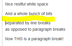
Consistent text spacing: line breaks versus paragraph breaks
On a website there’s a big difference between a line break (you get this when you press Shift+Enter) and a paragraph break (what you get when you press the Enter key). A quick look at the code will show you why. Here’s a screen grab showing both kinds of breaks in the visual editor:
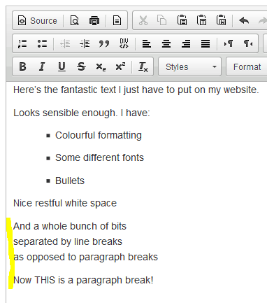
And here’s how the looks in the code.
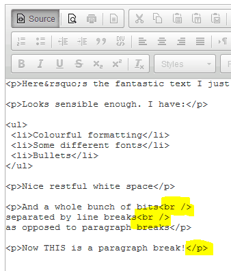
This can be why you get an unexplained mixture of line spacings in copied and pasted text. The narrower spacing provided by the line breaks can be useful, but if you want regular spacing between paragraphs just make them into Paragraph Breaks instead.
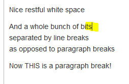
It’s easy. Just click at the end of the row where the line break is:
Press your Delete key and the line break goes away:
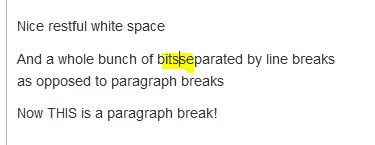
Now press your Enter key to create a paragraph break.
Fixed! Yes there is another one still to do, but you get the idea.
If nothing else, do these two
I’ve maintained a bunch of websites over the years and I’ve seen every kind of formatting mess you can imagine. These two make a big impact and are simple to fix:
- Use styles consistently site wide and always strip formats off before you paste.
- Pay attention to spacing between rows of text, and between paragraphs, and keep it consistent.
You might need to change some habits and find new ways to do old tasks. But when your site looks clean and professional on every page you’ll realise the result is well worth the effort.
Webstruxure is here to make the web work smarter. Let us know how we can help you for user friendly, mobile friendly and search engine friendly websites. Our services include:
Web design
Content strategy
User experience

Maddy Schafer is a writer and web content alchemist who does magic with words and images. She writes clear and direct copy, instructions which include all the bits you’re ‘supposed’ to know but don’t, and has super powers to read between the lines and deliver what clients want (instead of what they ask for). Working for Webstruxure, she provides expert content support to a variety of clients and also contributes to the Webstruxure blog.