A quick search on Google for “2019 SEO factors” will deliver an abundance of results. We’ve picked 4 points for you to focus on for your 2019 SEO strategy. Let’s dive right in.
1. Rankbrain and user experience signals matter more
Rankbrain is a machine learning system which Google uses to sort search results. After 1) quality content and 2) backlinks to other websites, Rankbrain is now Google’s third most important tool for determining page ranking. Rankbrain looks at four things to see how much users like the search results they get:
1. Organic Click Through Rate: This is the number of people who see you in a Google search and then click through to visit your site. The more the better, as long as they stay!
2. Dwell Time: This is the length of time users stay on a page. Because if they like your content they’re going to stay, right?
Pages in the top ten Google search result have an average Dwell Time of 3 minutes and 10 seconds. So depending on your business requirements, think in terms of:
- Long form blog posts about topics related to the services you provide (minimum 700 words)
- Comprehensive guides or information to fully answer users’ questions
- Useful, interesting, interactive and even entertaining content
- Well-structured content which is easy to scan, read, absorb and share.
3. Bounce Rate: When a user clicks through to your page and then quickly leaves, that’s a bounce. A high bounce rate on a page means the page content doesn’t meet user needs. If it did, they’d stay.
Rankbrain wants to serve up pages which meet user’s needs so if your bounce rate is high it will push your page down the rankings.
4. Pogo-sticking: Ever done a search, clicked a result, looked at the page and then gone straight back to the search results to try another option? That’s pogo-sticking.
The same as a bounce, it tells Rankbrain your content isn’t meeting users’ needs. If users consistently pogo-stick away from a highly ranked page Rankbrain will move it down the ranking.
2. Structured content will help you get into featured snippets
Remember when you could do a search and only get organic results? Now organic results compete with paid ads, carousels, answer boxes and featured snippets, all of which display before the organic results themselves. Here’s a search I did today:
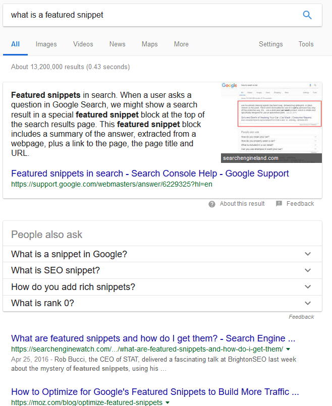
Besides the featured snippet in the screen grab above, there’s also ‘People also ask’ and either can answer a user’s question before they ever get to your top ranked page. Hence it’s desirable to optimise the content on your page to appear in relevant featured snippets.
What does it take to get your content into the featured snippet?
If your page a) ranks in the top ten and b) contains not only the answer users want but c) also their question, Google is more likely to put your content into the featured snippet box than not. After all, it’s exactly what the user wants!
According to Ahrefs you don’t need to be first in a search to gain the featured snippet spot, but you do need to be on that first page. Their research shows over 99 percent of featured snippets come from pages ranking on the first page for the relevant search term.
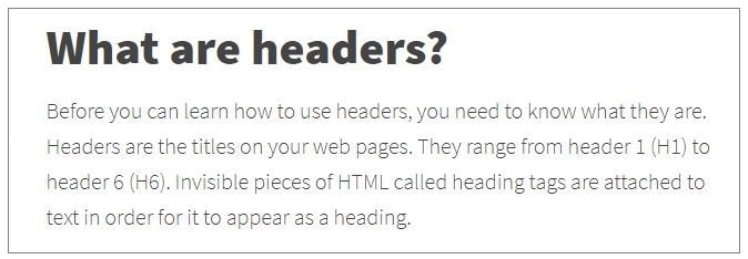
Optimise your content for featured snippets by writing a very clear answer to a question, such as definitions (eg. “what is”) or “how to” guides. Be sure to ask the question in your article. Below you’ll see the question used as a heading, with the answer following immediately as a short paragraph.
If users like what they see in the snippet (and/or on your organic listing) they click through to your page for more. Bonus – as your click-through rate increases Google also increasingly identifies you as an authority on the subject in question, and your brand awareness increases too.
Make sure your content answers users’ questions
Users want answers so when you’re writing for your audience, try to get inside their heads. Think about what they want to know when they’re searching for your product or service. The more you answer their questions and meet their needs with your content, the better your chances that Google will rank your page well.
There’s another good reason to do this. More and more Google ‘thinks’ like your audience does, so you want to structure your content in ways Google can use. Things like question and answer sequences, tables with structured content, anything where the question and the answer are clearly identified and linked. If Google sees a user’s question on your page with a well identified answer it’s going to make a match.
3. Content (… is King)
Yes, content is still a huge contributor to having your web pages rank well. It makes sense – well-written, informative, quality content is what people want.
Among other things Google wants to see your keyword appear in the right places:
- Title tag
- Meta description
- URL
- Image ALT text
- H1 tag
More than this your content needs to cover a topic in depth so users can find all the information they need in one place. Think comprehensive guides or long-form blog posts. In depth coverage gives two benefits:
- Increased Dwell Time: In depth content encourages users to say on your page and Google likes that.
- A healthy sprinkling of LSI keywords. Google likes them too.
Read more in our posts “SEO Audit – On Page SEO Checklist” and “How To Write User-Friendly And Search Engine Optimised Content“.
What are Latent semantic indexing (LSI) keywords?
LSI keywords are words that share the same context as the topic your page is about, so they are semantically related. They include synonyms and other words that often occur in relation to the topic.
For example if “apple” is your main keyword, “fruit”, “pie”, “tree” and “Braeburn” are all semantically related words.
Why are LSI keywords important?
It’s only relatively recently that Google started using LSI keywords to determine what your content refers to and its relevance to a search. Once upon a time keyword density was the only measure available, but it led to poor content being highly ranked because of keyword stuffing.
This is why Google now pays attention to LSI keywords instead. It’s much more likely that a legitimate page about the movie “Cars” would also contain “Disney”, “children’s film” and “produced by”. In contrast, a dodgy keyword-stuffed page is likely to contain only “Cars”.
There’s another reason Google uses LSI keywords: they help Google understand searcher intent. By understanding the topic of a web page and the meaning of a search query, Google can deliver better search results to the user.
How to find LSI keywords
The easiest way to find LSI keywords is to search your keyword and take note of what pops up in the “People also ask” box above the organic search results, and the “Searches related to…” section at the bottom of the search results.
Ideally address each related term in a subsection of your content. Even better use each as a subheading, and optimise them for featured snippets!
4. Google’s mobile-first indexing update is now fully operational
Mobile-first indexing means Google now prefers to index the mobile version of your website before the desktop version.
Before mobile-first indexing, search results would show a mix of mobile and desktop results. Someone searching from a smartphone would get mobile results, while someone searching from their desktop or laptop would get desktop results.
Now, it doesn’t matter what device a search is performed on – search results are based solely on the mobile version of a page.
What does mobile first mean to you?
If your website’s mobile version is different from its desktop version you have a problem.
Typically, differences happen when a mobile version of a page is missing content that is present on the desktop version. A mobile screen has much less real estate, so content is “optimised” (i.e. altered) to better fit the size and space available.
If the optimisation removes content which is key to your ranking position, your page ranking suffers.
Optimising your website for mobile
To rank well in Google, you need your website to have:
- Responsive web design
- Mobile user-friendly design
- Quick page load speed
What is responsive web design?
A website that loads content and alters page layout to fit the device being used has responsive design. Google recommends this approach.
Let’s check out the benefits.
SEO friendly
- All your content is on a single URL so no matter what device your visitors are using, they all go to the same website.
- Everything on a single URL also makes it easy for search engine bots to crawl and index your website.
- No messing around with rel=canonical and rel=alternate tags
- No need for redirects which can slow down your site
- No time spent keeping duplicated content on different URLs aligned.
User friendly
- On all devices your site adjusts for easy viewing
- No zooming in or out or scrolling sideways to read content
- Sites that force horizontal scrolling fail Google’s mobile friendly test.
Time saving
- With only one site to manage, save time and hassle.
Future proof
- Responsive web design adapts to new technology. New device? No worries.
Other options
- With an “M.” configuration, you can have a separate mobile version of your desktop site. However this means you have rel=canonical tags and duplicate content issues. “M.” configured sites are generally a pain to manage. Save yourself the trouble.
- You can try Dynamic Serving, where different CSS/HTML code is shown to the user depending on what device they’re using. This sounds good, but it comes with its downfalls. Dynamic Serving is notorious for showing desktop versions to mobile users. It also requires different versions of your content to be created to fit different devices so if your site doesn’t recognise the device being used, it could serve up a version that looks terrible.
Check your UX
UX stands for User Experience. It’s not enough just to have a responsive website, your mobile users need a good experience or they’ll ditch your site quicker than you can snap your fingers.
Make content easy to read
Think about a mobile screen. It’s small, right? Make your content easy to read by using:
- Short sentences and paragraphs (a couple of lines is good)
- Plenty of white space – avoid clutter on the screen
- High contrast between background and text so mobile users can easily read when they’re outside.
Show your users everything
Let me get this off my chest first: ditch the popups! Nobody likes popups, especially Google.
When your content is hidden behind a giant popup, Google can’t show your content, meaning they can’t do their job. They even put out an update targeting intrusive popups.
There are occasions where a popup is necessary, such as when a user needs to accept cookie usage.
Think about your popup and check out Google’s guidelines before you go ahead with it.
Buttons, search bars and the way home
What’s the goal of your webpage? Do you want users to sign up, buy something, share on social media? Make your Call to Action (CTA) button big and obvious.
Same goes for a quote tool, booking function, etc., whatever you want your users to do on your site needs to be front and centre.
- If your website users need the search bar, as they would in a shop or a blog, have it highly visible. Don’t make the user go on a treasure hunt through the menu. They’ll go elsewhere.
- And remember to give users a way home. Users expect to click on your logo and be taken to the home page. Another thing; users expect that clickable logo to be in the top left corner.
- See if your site has mobile friendly pages.
Read more in our posts “What Is A Responsive Website?” and “How To Create A Great Mobile Friendly Website“.
Speedy sites for mobile
- Page load time on mobile is crucial. More than half of all site visits are abandoned if loading takes more than 3 seconds.
- Longer load time = higher bounce rate = lower position in search results.
we must deliver and render the above the fold (ATF) content in under one second, which allows the user to begin interacting with the page as soon as possible.
That means the content you see on mobile before scrolling has to load almost instantly.
This is an ambitious measure but don’t worry, if your site is slow to load on mobile there are things you can do! Check out Google’s PageSpeed Insights tool to see:
- How fast your site loads on mobile
- Recommended actions to improve your results.
Want more information and tips about improving your page load time? Read on.
If your website needs an overhaul, talk to us
We do websites all day, everyday. We can audit your website and come up with a strategy to optimise content, design, SEO and user friendliness. So, if after reading the above 4 points on SEO has left you a little overwhelmed, get in touch and let’s talk about how we can help.

Briaane currently works for Webstruxure as a website coordinator in Wellington. Between plugging away at Search Engine Optimisation and content creation, Briaane can be found curled up with a coffee and a Sci Fi book, or broadening her skills and talents. You can connect with her and see samples of her writing on LinkedIn.